Visual Arts Reviews
2015 ART EXHIBITION - Burbage Art Group
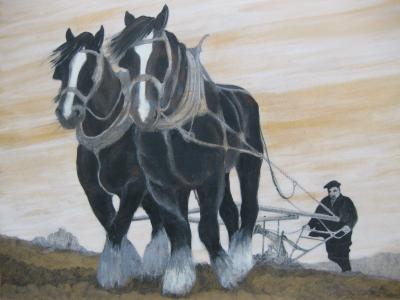
Before entering the exhibition I was unsure of what sort of art I was going to see; however was extremely impressed by the variety and talent that was contained in one small space.
The exhibition was situated in Burbage Institute, with most of the pieces in the smaller room to the right and some more in the main hall. There were also cakes, tea and coffee available (which always makes any experience better). The art was laid across tables around the perimeter of the room, with some in the middle, and were grouped by artist. There was also a small text written by each artists work explaining how they became part of Burbage Art Group and what mediums they enjoyed working with the most.
It was interesting reading all the different stories of how people had become part of the group and nice to hear how they incorporated their interests into the art they produced. The atmosphere was very welcoming and calm, and the art was of course fantastic. I was hoping to pick out a few pieces that stood out to me however this was harder than I imagined. All the artists had very different styles which made it an interesting exhibition to look at. There were landscapes, still life and portraits.
Two artists that had chosen to paint still life were two of my favourites: Laura Critchlow and Irene Gartside. Both of their paintings used acrylic and both were excellent with good use of light and colour. Another artist that stood out to me was Mike Jackson whose art mainly featured boats and coastal scenes. They were beautifully painted with watercolour, particularly one named ‘When the Boat Comes In’.
My favourite however was Maria Hyde who had a variety of pieces, mainly made up of portraits and landscapes. Her pencil drawings were outstanding and incredibly detailed – I especially liked her drawings of Olivia Colman and Tony Blair.
Although I have picked out a few of my favourites, I feel that credit should go to all the artists who have taken the time to produce such wonderful pieces of art.
Rachel Cooper
ARTO FUNDUKLIAN - HIS PERSONAL CHOICE - Buxton Museum & Art Gallery

Arto Funduklian was born in Constantinople (now Istanbul) in the late nineteenth century. The son of Armenian immigrants, who left the Ottoman Empire to escape the persecution and massacre of Armenians, he grew up in Manchester. His mother, father, three younger brothers and his sister, lived in a large red-brick house on Pine Road in Didsbury called “Massis” where they had servants and a large garden. The family ran a successful carpet business – presumably importing carpets. Here they were part of a large, local Armenian immigrant community who were involved in philanthropic works.
In his later years, Arto came to live with his brother, Vahe, in an apartment on St. John’s road, Buxton, where they were looked after by Sarah and Hannah Stubbs. After Arto’s death, in 1980, Vahe offered his brother’s art collection to Buxton Museum and Art Gallery. Their housekeepers were allowed to choose paintings and ornaments as a keepsake. In 2014, the Stubbs family gave these back to the museum so that Arto’s collection could be re-united.
Arto graduated from Cambridge in 1914, then spent several years in New York and Paris working for the family business, where he was part of the ‘avant garde’ art scene and became friends with artists. A wealthy man, Arto started his impressive art collection in Paris in the 1920s; it’s a collection which spans many years, and includes paintings, etchings, lithographs, sculptures and ‘objets’ by many artists now famous such as Monet, Matisse, Chagall, and Utrillo. He also favoured British artists such as L.S. Lowry, John Piper (who designed the stained glass window in Coventry cathedral), James Macintyre and Duncan Grant. There are even some works by female artists such as Emmeline Boulton and Marie Laurencin.
This exhibition is excellent and really worth a visit, in fact probably more than one. It’s beautifully laid out with lots of clear, concise information. There are a wide range of artistic styles and mediums from sombre black and white etchings of 19th century Paris by Edgar Chahine – complete with personal messages to his friend Arto alongside his signature – to colourful oils and watercolours. Particularly eye-catching is the large water-colour called “The Bridge at Nemours” by Pol Matthieu which captures the reflections of the bridge in the water so skilfully that you think the strong colours must be oils. There is also a wonderful bronze ‘Pig’ by sculptor Georg Ehrlich. The Lowry is one from the late 60s called ‘Seaside Promenade’ which was not one I remember having seen before – a departure from the usual street scenes but with his trade-mark stick figures in the fore-ground.
My thanks to Laura Waters at the museum for talking to me about the exhibition. The museum have been helped by local Researcher and Performance artist Sarah Coggrave who (coincidentally) became interested in Arto’s family after living in a flat in his family home. She has a blog and is also coming to “perform” at the Exhibition, in a fee theatrical event - as the character of Astra – Arto’s sister – on Sat July 25th and Sat August 15th both 2-4pm. The exhibition runs to September 6th.
Karey Lucas-Hughes
BUXTON ART TRAIL 2015 - Buxton Art Trail

The Art Trail contains a variety of artwork from artists both amateur and professional; I was immediately enticed by the individuality and creativity of the work. There was a really positive atmosphere on the trail which was heavily influenced by the artists themselves who took great care in explaining how they produced their art and the reasoning behind it.
The first artwork I saw was Paula Hobdey’s, which was a great start to the exhibition. Acrylic is her medium and she has cleverly found many different ways to use it, producing landscapes and still life pieces by applying the paint thicker on the closer objects and a thinner layer of paint further into the distance to create depth. The pieces that stood out to me the most were the still life pieces of flowers; I loved the detail. ‘Poppies’, ‘Flower Power’ and ‘Tulips’ were some of my personal favourites because of the colours used; there was a wide palette ranging from yellows, to reds and blues and I think this really catches the eye of the viewer, and adds to the ‘summery’ feeling. I also loved the fact that before even looking at the names of some of the landscapes I knew straight away where they were; quite a lot of them being scenic places in and around Buxton. The whole atmosphere of Paula’s exhibition was very welcoming and I thoroughly enjoyed looking at her work.
Another favourite of mine was Beverly Threlfall’s work, which caught my eye as soon as I arrived. I also found it very interesting how she produced her work. Her ‘A Waiting Place’ series was produced with smoke which is very unique and interesting, and it added a great feel of abstraction to the pieces ‘Female Portrait’, ‘Reclining Nude’, ‘Standing Female’ and ‘Male Nude’. These pieces weren’t all that detailed which the artist explained was because she wanted the viewers to interpret them in their own way. Some of the pieces, especially ‘Male Nude’, were quite abstract and until looking at the name of the piece, it wasn’t clear what it actually was; I really liked this because it allowed self-interpretation. Another series produced by this artist was ‘Unsaid Things’, my favourite of these pieces being ‘Large Water Colour Double Portrait’ because of the sense of ‘vogue’ that it portrayed. I also really liked the inaccuracy of the watercolour compared with the accuracy of the actual drawing of the portraits and finally the colours used were striking - the contrast produced by the yellow in comparison to the purple really caught my eye and made me want to look at the piece even further.
Finally I found the pieces produced by Catherine Serjeant very interesting as they all consisted of objects that she had collected (and at the time, hadn’t considered what she was going to do with them.) ‘Playing with Pottery’ I found very interesting as it can be left for personal interpretation, the fact that there is a mug handle on the board and different pieces of pottery around it made me believe that it imitated a mug being thrown at a wall and smashing into pieces.
Work by both Beverly and Catherine were presented outside however this didn’t stop people wanting to look at the work and the atmosphere was still very pleasurable, despite the weather.
Overall the trail was very successful and it was marvellous to see such a great variety of art from many talented artists.
Shannon Booth.
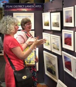
THE DERBYSHIRE OPEN 2015 - Buxton Museum & Art Gallery
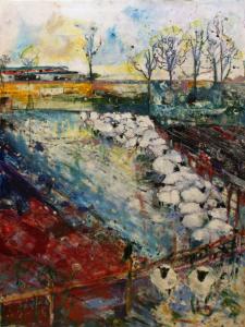
Never underestimate The Derbyshire Open. Now in its 33rd year, it remains a must-see in the Fringe’s Visual Arts category featuring 104 enticing works on a Derbyshire theme selected from 323 entries by a panel of judges including artist Rob Wilson and arts practitioner Paula Moss.
26 of these are from young people aged 21 or under and their works make a great first impression on the landing. A delicate watercolour, Matlock Steps, by Charlie Collins caught my eye as did Olivia Brennan’s Mossy Stone Reflections, creating a watery feel both in and out of the water. Eloïse Key’s Thinking Fox won The Derbyshire County Council Young Artist Award and is featured within the main exhibition – an iconic monochrome in acrylic that proves striking even from across the room.
Young artists were also involved in the work that won The Friends Sculpture Award – Aviary for the Endangered, a ceramic project from The Artbox Artclubs which is beautifully executed and puts over a strong message about conservation. I have been known to walk straight past Derbyshire Open sculpture but not this year with Jamie Hargreaves’s The Key to Derbyshire Woodland – a woodpecker made of keys – and Sam Barnett’s ingenious Derbyshire Dragon being among several 3d highlights.
Half the fun of the Open is disagreeing with the judges. Winner of The Derbyshire Trophy, Kinder Downfall by Stuart Johnson, is hugely intricate – I challenge you to count the rocks – but didn’t really move me. A good range of prizes acknowledges the sheer variety of the exhibits with Louise Jannetta winning a Derbyshire County Council Award for her escapist collagraph and drypoint work Come Fly With Me, in which we fly with birds over the Derbyshire landscape, and Laura Critchlow taking the Made in Derbyshire prize for her exquisite miniature, Windfall.
Visitors are invited to make their own choice. For me it was Moira’s Dog, Kasper, a symphony in pastel colours by Margaret Rose, but I also found much to admire in other works such as Frances Daunt’s very woolly The Wool and the Wall, Sue Lewis-Blake’s blue-green watercolour Highlights, Clare White’s mixed media Out of the Valley featuring what looked like real honesty seed heads, Lesley Griggs’ romantic oils and many more besides.
I also thought the hanging of the art was very intelligent – some vivid food paintings were placed together as were a couple of fascinatingly contrasting pictures featuring silver birches. The only thing missing throughout is some explanation of the Derbyshire connection as perceived by the artist.
This is just one of several exhibitions at the museum currently and with The Green Man just around the corner featuring its Fringe shows plus from July 17 the Buxton Spa Prize entries, there is a real opportunity to gorge on some fantastic art – enjoy!
Stephanie Billen
DERBYSHIRE STONE - High Peak Artists
The High Peak Artists have clearly been allowed to run wild with their brief. The theme ‘Derbyshire Stone’ is a clear link between the wide range of exhibits, while each artist has clearly seen this idea very differently, interpreted it in their own ways, and each used their mediums to put their own, unique spin on it. One would recommend using the exhibition as a perfect excuse for a cake stop. Take a seat in the beautiful Art Café, overlooking the Pavilion Gardens, take a cup of tea, and view the artwork at leisure.
The beauty of this exhibition is the range of art work. Many have used traditional mediums, all to the advantage of demonstrating their skill and the beauty of the landscape. Two of my personal favourites were Jane Dewberry’s embroidered “Poole’s Cavern” stalagmites, and Hannah Dodd’s felt work “Solomon’s Temple, Buxton”. Both have mixed the soft textures of their materials with the hardness of the landscape and the stone itself, creating beautiful, miniature portraits that draw the viewer in for a closer look at the detail.
Some have used Derbyshire stone as their material itself, although perhaps not as many as one would have hoped. However, the beautifully carved sculpture on Hilary Morel’s “Jackdaw” necklace more than makes up for it.
The uses for stone differ widely through the paintings, drawings, and photographs, and it is this perhaps that makes this exhibition so engaging. Stone in a practical use – to build with, or as something recreational. Stone as something so historically vital to our county, in the form of millstones, the well-known doughnut shape appearing across the range of work. And, of course, stone as something for the local birds to perch on and sing, at the beginning of a fresh spring day.
This exhibition is well worth a visit, whether you’ve lived in Derbyshire all your life, or you’re new to the area, the artwork, while some non-specific to Derbyshire, certainly captures the spirit of the area, its wildlife, and cultural history. All of the artwork is for sale, so if you find yourself particularly attached to something, never fear. Relax, unwind, and enjoy the beauty of Derbyshire through the eyes of some very talented local artists.
Ariane Dean
DR SKETCHY SHEFFIELD AT THE BUXTON FESTIVAL FRINGE - Dr Sketchy Sheffield
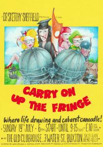
I try to get to as much of the visual arts as I can at the Fringe, and I was intrigued by the description. Art, cabaret and burlesque eh? See what I mean. Well, hosted by the lovely Lara, this is less of a show and more of an event, but enjoyable fun all the same!
The concept is relatively simple, get art loving sketchers into a room together, give them a range of models and set them a series of timed poses of characters. Easy. The idea was New York artist Molly Crabapple's, and now there are over one hundred Dr Sketchy outfits around the globe. Each show has a theme and this year's Fringe show was “Carry on up the Fringe” with, you've guessed it, characters from the eponymous film franchise. The challenge for the sketchers is to create their sketch within a specified time. This may vary with the complexity of the subject, the were seven models in one pose, which adds to the sense of fun. Last night was I suspect, a gentle on for the sketchers, with five minutes being the shortest time, although Lara did tell me that just two minutes has been tried on more than one occasion!
It was interesting to see the different ways in which the sketchers worked, and of course they all produced sketches in different styles for different models throughout the evening. Some were made in ink, some in charcoal, some coloured pens and even pencil was to be seen. All the participants were really engaged in the show, probably the most 'audience participation' I've ever seen in anything at the Fringe. Everyone was a picture concentration when working on their sketch, and at times some furious scribbling was evident as time ran out. Hard work, yes, but good fun also. The evening was interspersed with prizes – but no-one was under pressure to put their work up for public scrutiny. If you wanted to keep your work private you could.
The whole evening was conducted in a relaxed atmosphere aided in no small way by the background music – a selection of 1930s classic (and less classic) songs and more. Gracie Fields, George Fromby and Cab Calloway were recognizable as was a scene from Will Hay's 'Convict 99' which bought a surprised look to a number of faces around the room! All in all a good night. I know at least 3 people already who I've spoken to who'd like to go to next year's show. The power of word of mouth eh?
Thanks again to Lara and the team for a great evening.
Ian Parker Heath.
FRAGILE DREAMS IN SOLID STONE - The Green Man Gallery
When you walk in to the Green Man Art Gallery, you instantly sense the atmosphere of the building, the aftermath of renovation and positivity. The ‘Fragile Dreams in Solid Stone’ exhibition is a physical representation of that hope, by means of fantastic art work.
As I walked into the exhibition I was instantly hit by its emptiness, I expected a complicated, hazardous room that I would be scared to move around in, due to the implication of the word ‘fragile’. However my expectations were deceived, and the term “Quality over quantity” was the cliché that instantly came to mind. The symbolism of the room itself and all the art within was what persuaded my preconceived idea of art to distort. I am not an artist however the experience of this gallery and this exhibition was what made me want to see more. The symbolism of the room intrigued me and after speaking to the volunteer everything made sense.
It was hard to find a piece in this exhibition that was better than another, however there were two pieces that stood out to me personally. The first one being Suzanne Pearson’s – Hardwick Ballroom painting. This beautiful, dreamlike piece gave you an insight into Buxton’s colourful past. It stood out instantly in the derelict room and really expressed the vibe that the director and volunteer were implying. The tone of the piece reminded me of a fairy tale story, the ballroom dancing leading to a troublesome world of war and eventually progressing to today – hope and restoration, a place of art and individuality. The second piece that stood out to me was Wendy Butler’s wall piece. The burst of colour and mixture of modern and nostalgic qualities also complimented the symbolism of the exhibition. The contrast between the peeling canvas and the bright colours signified the renovation-hope for the building itself. I enjoyed the modern representation of the Polaroid’s and their matching words, showing the progression from the original unsure attitude towards the building and the new positive, optimistic view of the place.
The textiles and photography on display also showed a contrast of this traditional feel about the residence (textiles) and the new modern episode of the building (photography) which will be a place of performance and platform for all ages in Buxton. There was nothing in this exhibition that I would say I disregarded or ignored when walking around, as I know from past experiences in art galleries, some things are more enticing than others, but there was nothing on display that made me want to ‘hurry up and leave’.
Reviewing this exhibition was a pleasure and a real eye-opener (for me) into the world of art and The Green Man Art Gallery. It is definitely worth a visit, whether you have 10 minutes or an hour, you will not be disappointed.
Eleanor Hibbert.
THE GREAT DOME ART FAIR - Peak District Artisans
18-19 July (preview evening 17th July)
Peak District Artisans bring together this delightful offering of fine artists and designers under the spectacular setting of the University of Derby’s Devonshire Dome. On the preview evening, there are people to welcome you in and offer directions should you be seeking a particular artist. Otherwise take a moment to appreciate the quantity and quality of what’s on offer, and then make your first decisions – do you head down the middle, or start working around the edge! Alternatively you can head directly to the bar (I suspect tea, coffee and cake will be available during the day). The ambience is gentle, with live music adding to the artistic feel in the Dome – nicely judged and not intrusive.
As always there is a variety of art on offer, including painting, jewellery, sculpture, ceramics, textiles and furniture, and different styles catering for a variety of tastes. My friend’s eye was caught by Yuka Jourdain’s felt jewellery and I relished the tactile nature of Vivienne Siller’s ceramics – where you are encouraged to pick up and handle pieces. Sue Prince’s folk artist work has a distinctive look and I was particularly drawn to her painting of a woodpecker.
The Great Dome Art Fair gives you the opportunity to talk to artists and learn more about their backgrounds, inspirations and how they create their work. I enjoyed hearing Rosalind Smith talk about how she had discovered her flair for ceramics and found her English Earthenware very striking. I caught up with Richard Prime and love his inclusion of field sketches in his work.
The event gives you an opportunity to bid in a silent auction (proceeds going to Lane End Farm Trust) and you can always purchase a raffle ticket (as I do every year) to win an original ‘postcard’ piece of art work from many of the exhibiters (which I never do!)
Highly recommended and guaranteed to lift your appreciation and inspiration levels. The quality and standard of the exhibits and exhibiters is of a high standard and yet accessible.Take your time, maybe join a demonstration or a talk. And there’s always the excitement of taking something home with you, whether an original piece or a simple card to send to a friend.
Maria Carnegie
GRINLOW ART AND STORYTELLING TRAIL 2015 - Grinlow Makers and Creators
Grinlow Makers and Creators are back for another year, with their spectacular art and storytelling trail up through Grinlow woods. Most of their artwork centres on the forest as a living thing, and the spirits living inside. The many trails in the wood are decorated with fairs, crafted from pegs and wire, crocheted nests, and poems and riddles hang from the trees. Together it makes for quite an ethereal experience, and one can’t help but feel satisfied when one stumbles across another full size exhibition. Some of the larger art work includes traditional painted canvas - some which shares a likeness to the well-known art of Greyson Perry -, sculptures, and dainty models mixed through the woodland floor.
Through the time in the woods, there are arts and storytelling events on – we arrived just at the tail end of a painting class to find a group of six year olds very cheerfully splatting paint onto pieces of bark, while three dinosaur skeletons looked on in the distance. Often the sounds of acoustic guitars could be hear in the distance, and along with the fairy circles, flags, and art hanging from the trees, the Makers and Creators have crafted a beautifully ethereal experience – especially for one used to walking through the woods when they are considerably more bare.
One of the wonderful things about the trail is that it is open for literally everyone. Literally. Everyone. Being in a wood, it’s a fantastic place to take small children and dogs to be around art without snotty gallery staff peering over your shoulder every ten minutes. I would however just point out that some art may seem a little ambiguous to children. We saw some kids attempt to work out whether or not one installation was a slide, which while quite funny, perhaps won’t always end that well.
The trail is fun, and friendly. The art ranges from heart breakingly professional for it to be lying on the floor of a forest, to the more homemade, fun, flirty sort of art. Some, such as the dinosaur skeletons, is quite entertaining, while others are a little more grown up, a little more serious. Most of the artwork is mixed media.
The trail makes for a lovely afternoon in the woods, take your time, read the poems, and keep an eye out for any special events that may occur…
Ariane Dean
THE HIGH LINES - Brian Adams
The start of this year's Fringe found me at one of my favourite Buxton places, the Museum & Art Gallery, to see Brian Adams' latest show. High Lines, we are told, is a portrayal of the English (specifically) countryside. This is a place that Brian feels is, despite man's intervention, somewhere that retains something of nature about it; a place for contemplation and beauty. His aim is to show our relationship with the land.
Adams has chosen 19 monochrome images to do this, and all are taken on the Monsal and High Peak Trails. Users of the trails may well recognize where the images were captured having walked of cycled past or through them, but Adams has eschewed many of the more obvious grand landscape vistas for the small-scale. The 'natural' year is captured nicely in a series of images 'Water Tank' and others too reveal time passing unobtrusively. Which is more than can be said for the pigeon in one shot! But that's nature.
The decision to use the trails as a base means that there is a lot of 'man' and rather less 'nature' in the images I thought. Of course, the landscape we see is almost entirely artificial – created by human activity over millennia – but even allowing for this there were turbines, poles and buildings which while speaking of our relationship with the land are not contemplative subjects in themselves. Well, not for me at least.
This collection of images is one that may well produce divided opinions about our relationship with 'the land' and how we choose to represent it. Do go along and see it, and make up your own mind.
Ian Parker Heath
MAKING YOUR GARDEN GROW CELEBRATION/EXHIBITION - High Peak Community Arts
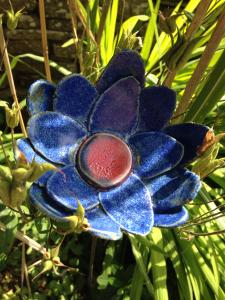
In the very Fringey spirit of more is more, extra flowers have been added to the Pavilion Gardens conservatory thanks to a fantastic combined effort from Project eARTh, Artbox ArtClub and Buxton Infants School working with talented artist Caroline Chouler-Tissier.
The flowers are ceramic and mainly on sticks amongst the foliage. Some have a botanical look with stamens or tubular petals, some are delightfully fantastic or, like the giant garden daisy there, dizzyingly out of scale. There are further flowers displayed on the wall plus ceramic plant labels and beautifully-decorated plaques. On the ground are highly creative bird baths, some of which have been made by Caroline herself. The participants have also written labels featuring their nature-inspired thoughts, poems and memories with one person recalling running through the long grass aged 10 and another describing childhood games with buttercups held under the chin – to see if you like butter, of course.
The whole thing is a huge celebration of community creativity but the word Celebration in the title also refers to the well-attended unveiling of it all on the first day. Patron of High Peak Community Arts, Joan Bakewell, sent an inspiring message imploring us to “please celebrate the joy of being creative”. Art, she said, “makes us value all sorts of small things that can add up to really big things.” The event was attended by the project’s many participants as well as the Mayor of the High Peak and Councillor Steve Freeborn who pointed out that ceramics played an important part in the region’s industrial and artistic history and stressed the importance of the arts generally saying: “Every piece of art that you look at is working on you as an individual.” As for Caroline, she told the audience: “It’s been an absolutely brilliant experience and I just can’t wait to get in the studio to make some more.”
It is good to learn that Project eARTh has been awarded another five years’ funding from the Big Lottery enabling it to continue its arts sessions for adults experiencing any form of mental distress or enduring other long-term conditions. It is hugely therapeutic for adults and children alike to engage in 3d art-making and doubly rewarding when it adds up to something as collectively beautiful as this exhibition.
For further information about High Peak Community Arts and its many initiatives contact mail@highpeakarts.org.
Stephanie Billen